The Psychology of Color in Chiropractic Branding: Building Instant Patient Trust
Before a new patient reads a single word on your website – before they see your credentials, your services, or your five-star reviews – their brain has already made a judgment about you. It took less than 90 milliseconds.

That judgment was made entirely by color. The psychology of color in chiropractic branding isn’t a design trend or a stylistic preference. It’s neuroscience and it’s either working for your practice or quietly working against it. Let’s break it down.
1. Why Color Psychology Is the Foundation of Your Practice Identity
Color is processed in the brain’s visual cortex before language, logic, or conscious thought. According to research by Dr. Robert Hecht-Nielsen (Neurocomputing, MIT Press), the brain processes visual information 60,000 times faster than text. Color hits first. Everything else follows.
Here’s what that means practically: your color palette is activating either your patient’s sympathetic nervous system (fight-or-flight, stress, alarm) or their parasympathetic nervous system (calm, safety, openness). The wrong colors don’t just look bad – they make people feel subtly unsafe before they’ve even booked an appointment.
Color is not decoration. It’s your first clinical impression.
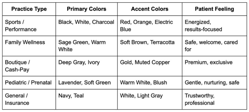
2. The Chiropractic Color Palette
Different colors carry different cognitive associations and in the psychology of color for chiropractic practices, matching those associations to your target patient is everything.
Blues & Teals – Trust and Clinical Credibility
Blue is the industry standard for healthcare, and for good reason. It consistently scores highest for trust, professionalism, and cleanliness across cultures. Teal adds a layer of approachability that pure navy lacks – it says “clinical” and “calm” at the same time. Best for: general family practices, pain management clinics, insurance-based practices.
Greens – Growth, Nature, and Organic Healing
Green speaks directly to the wellness-minded patient. It signals natural, holistic, and restorative care. Sage and forest greens work especially well for functional medicine or nutrition-integrated chiropractic. Best for: holistic clinics, cash-pay wellness practices, integrative health brands.
Purples and Soft Greens – Nurturing and Gentle
Lighter purples (lavender, lilac) and muted greens communicate safety, softness, and care. These are the colors of trust without intimidation – ideal for practices that serve vulnerable populations. Best for: pediatric chiropractic, prenatal care, anxiety-sensitive patients.
Black, Gold and Deep Red – Authority and Performance
High contrast. Zero apology. These palettes say premium, results-driven, and elite. They attract athletes, executives, and patients who want outcomes – not ambiance. Best for: sports chiropractic, performance clinics, high-end cash-pay boutique practices.
3. Strategic Color Selection: Aligning with Your Target Audience
Generic branding attracts nobody. The practices that grow fastest are the ones whose colors speak directly to a specific person. Here’s how to think about it:
See more: 5 Common Branding Errors in Chiropractic Clinics
Conclusion: Color Is the Hook – Consistency Is the Reel
The psychology of color in chiropractic branding is one of the highest-leverage, lowest-cost investments a practice owner can make. The right palette doesn’t just look good – it attracts the right patients, repels the wrong ones, and communicates your entire value proposition before a single word is read.
But color alone won’t build a brand. Consistency will. A brilliant palette applied inconsistently across your website, signage, social media, and patient materials loses its power quickly. The practices that dominate their markets are the ones where every touchpoint feels like the same trusted voice.
Is your current color palette attracting your ideal patients or sending them to the practice down the street? We offer complimentary Brand for chiropractic clinic owners who want an honest, expert assessment of their visual identity. We’ll look at your current colors, your positioning, your digital accessibility, and your cross-platform consistency and tell you exactly what’s working and what needs to change.
Book your Brand Experts today at MyChiroPractice. Because your brand should be your best referral source and it starts with color.