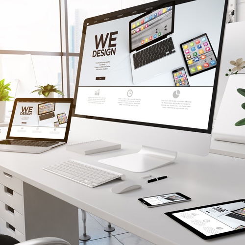
Online Chiro: Best Website Design
There’s so much more that goes into a website than just making it “pretty.” Outside of a nice design, most importantly it needs to be functional and user friendly too. If you surf the internet, you will find many websites on both ends of the spectrum: beautiful designs that are impossible to navigate or functional websites that are missing that wow factor. If you’re ready for your website to come with all the bells and whistles with the best website design possible, we will dive into all the factors that you need to consider.
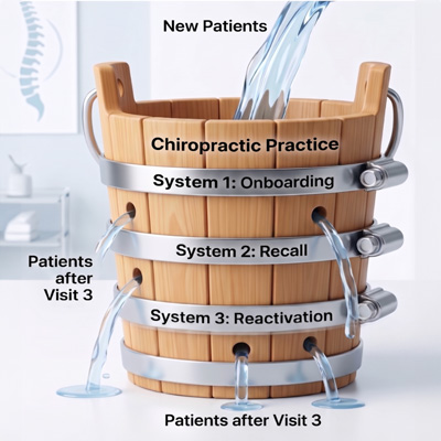
Getting Started with a New Website or Website Audit
While all of the variables we will discuss below are important, it’s important not to get overwhelmed and think about figuratively throwing your website out the window. You probably know that your website has the potential to get you all the clients and cash flow you need with the right work. Thus, simply strive to address one piece at a time until you get it to where you want it.
Alternatively, you can leave your website magic to the professionals. There are design teams out there that do this type of work everyday all day for a living. They understand the nuances that website browsers are looking for so that you maximize your return on investment with your online presence. Just like you wouldn’t want your clients to go to a chiropractor that hasn’t been through appropriate credentialing, why leave your website to an amateur? There are even entire website design companies dedicated specifically to building online chiro websites. Pretty awesome, right?
That’s exactly why My Chiro Practice was founded. We’ve got you covered with the best chiropractic branding, website design, and marketing tools so that you can focus on what you do best: chiropractic patient care.
What Goes Into a Well-Designed Website?
Let’s dive into the main factors to consider when you want a website that blows the socks off your potential clients and keeps you competitive in your local chiropractic market.
Usability
Ever been to a website that just doesn’t work? The buttons don’t go anywhere, it keeps freezing, and you get frustrated and move on. Making sure all the parts of your website work in sync and go where they are supposed to go is very high on the priority list of a good website. This includes having a navigation bar that works and helps a user quickly find what they are looking for on your page. Plus, don’t forget a handy search bar in one of the corners.
Accessibility
Once your website is user friendly, the next question is whether your visitors have access to the information they actually need. Is it clear how they get a hold of you? Can they find your phone number or address? Is there a place to ask questions? Can they easily learn more about your clinic? These are all important factors to consider. Plus, any other information that you think is vital for them to know.
The Design Itself
Of course, a beautiful design is essential. But above that, the design should flow seamlessly. This means that there is a clear theme to your website that doesn’t leave an internet browser feeling confused or like they got whiplash from the mix of themes, colors, and text. The bottom line here is that the logo, imagery, colors, text fonts, and other design elements should all mesh well together and carry the same overall theme throughout every page on the website. This is where branding and design meet to give you a uniform overall look that is aesthetically pleasing.
Don’t Get Carried Away with Design Elements
For the sake of simplicity, it’s worth mentioning again that having “all the things” isn’t necessarily better when it comes to a website. In fact, some website design research indicates that elements like pop up forms, carousels, and stick menus are overwhelming to a user and can lead to a bounce. It’s easy to get carried away with website design. Just remember, striving for functionality and simplicity is almost always best.
Check Your Design on Different Mediums
People browse and search on all kinds of devices these days. Thus, you want your website to look great on all of them. That means taking the time to design your website for different types of technology- primarily cell phones and desktop monitors. First, we recommend you focus on cell phone design since this is where the majority of your traffic will probably come from. From there, then ensure that it is user friendly across all modalities. This includes making sure the page fold view (the first part of the page they will see when it loads) is optimized with all the elements it needs falling above this line.
The 5 Second Rule
Did you know a person will decide whether they’re going to stick around on a webpage in mere seconds? Thus, you want to give a clear picture of what you’re offering as soon as their eyes hit your webpage. A good rule of thumb is this: can a person figure out what your primary focus is after looking at the page for just 5 seconds? If not, it’s time to make some changes and get crystal clear on your message. Your first impression and primary message are crucial to get your clients to stick around a little longer on your page.
Your Call to Action
While considering your messaging and offer, it’s important that you are also clear on how people can take the next step with you. Can they schedule an appointment online? Should they call your office? Should they shoot you an email? Whatever that next step is, make it easy for them to follow through. The more explicit you are the better with bright buttons and obvious text the better. Don’t assume they know what to do! Also, try to keep your offer and steps as simple as possible. It has been found that offering too many options (or steps) to a potential client can backfire and leave them feeling frozen with indecision.
Use Visual Cues to Get All Eyes on Your Call to Action
It’s amazing how suggestible we are when browsing websites. Simple little adjustments to a website, such as an image of a person looking at the text you want then to read or an arrow pointing at a button that says “click here,” can actually be magical for conversion numbers. Once again, don’t be afraid to be painfully straightforward with demonstrating what you want your potential clients to be doing.
Don’t Forget the Social Proof!
If your beautiful design and clear call to action haven’t persuaded your potential customer yet, it’s time to bring out the big guns. As they scroll through your website, give them all the proof they need that your clinic is awesome and ready to serve their needs. That’s where testimonials from your best clients are essential for piquing their interest. When they know that other people have had good results, they are more likely to feel confident in booking an appointment with you. Try to choose a variety of testimonials that demonstrate your services and who you cater to as well.
Listing Your Services
These days, most of us scan documents more than we read them. So what do we actually retain the most as we’re quickly scrolling? When it comes to lists, it turns out that the top and bottom of the list are most memorable. Thus, if you have a services page that lists your top options, try to list the most important ones at the beginning and end for the best outcomes.
Leave It to The Professionals
You now have plenty of things to consider when it comes to optimizing website design. If you can go through each of these factors and make adjustments to your website, you should notice immediate changes in your bounce rate and client conversion rates.
If you don’t currently have a website, are you thinking about downloading wordpress, picking a free theme and going for it? Quite honestly, just picking a theme can be overwhelming to a website newbie. Plus, it’s hard to tell if a particular theme will hold all the functionality you need. Without being a coder, there are a lot of potential glitches that can occur. For example, one theme may look amazing but lack the ability to build in the appropriate navigation, sign up page, or include a map to your clinic in it. This can lead to hours of tinkering just to have to try a new theme and start over. And who has time for that?! With a bustling successful business, probably not you!
Again, this is where choosing a website designer that understands the ins and outs of chiropractic websites can save you hours of frustration and start boosting your cash flow as soon as possible- making it 100% worth the investment. At My Chiro Practice, we understand what you need for ads, funnels, search engine optimization (SEO), marketing and more. Having a one stop shop for all your website needs makes the whole process much more streamlined.
A good website design is vital for a thriving chiropractic practice in today’s technological world. Are you putting your best foot forward?